
UI Comparison: BigBasket vs Swiggy Instamart

In today’s post we’ll be looking at the customer journey, user interface and user experience of two grocery delivery apps – BigBasket and Swiggy Instamart and compare them based on user experience.
Customer Journey:
With the latest update of BigBasket app, when you open it, you get prompted to choose one of the two customer journeys – BB beauty store or BB Grocery store. This is a good way to let your existing users know of new offerings on the app and this screen is fairly simple and straightforward. BB has separated the 2 customer journeys entirely at the start and is like having 2 apps within an app.
On the other hand, Swiggy provides different tabs at the bottom of the screen for its different verticals like Swiggy Genie, Swiggy Instamart, food delivery etc. Swiggy’s UI is more seamless and easier to transition back and forth between tabs. While in BB, once the user chooses grocery store, they will have to abandon their progress inorder to switch to the beauty store
.
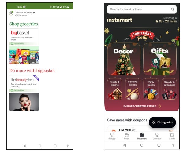
Landing Screen:
For the landing screen functionality, Swiggy trumps BigBasket.
Once you select the BB Grocery app, you are greeted with a screen divided into 3 major sections:
- The search bar
- The offers section/carousel
- Shop by category
Instamart on the other hand shows the following:
- The search bar
- Seasonal offers
And after one scroll, you get to the actual functionality of app which displays:
- Coupons
- Items commonly purchased in a horizontal scroll/carousel format
- Offers section
- Shop by category
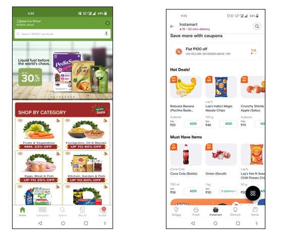
For an app looking to emulate the offline grocery store experience, the horizontal scroll option works better as it mimics the aisle feel much better than a listing option. Also, in a single panel the user is able to view ~3 products and a lot of buying in this category is impulse buying. Hence, having a panel higher up on the landing screen showing items like bananas, chips, soft drink, onions etc. allows user to quickly add items he/she may have originally not opened the app for. It is interesting to note that these items do not fall into one single category but usually. The offers section is below that and then does a user find shop by category section.
The Swiggy user interface feels more intuitive and better mimics the offline store experience where a customer walks into the store to buy something specific but picks up other items as he/she sees them on display. Similarly, the users land on the app to shop for a specific product and proceed towards search but can incidentally glance over the the items present in the commonly purchased carousel and add them to cart.

The “Search” mini-product:
Before delving into the Search experiences of both products, let us first understand the significance and vitality of the "search" bar in such apps. The search bar is a mini-product for e-commerce websites because the accuracy of the results predicts whether the user will browse further or not. According to a BigBasket PM who was in charge of the "Search" product, the following were common issues that hindered functionality of search bar:
- Misspelt words: With English not being our first language, major issue e-commerce apps face are incorrect search keywords. This leads to wrong results which not only hampers customer experience but also costs company a potential buyer. Certain items like Rooh-afza and even biscuits had over 500 different variations of spelling on the platform according BB PM.
- Regional names of grocery items: People usually refer to commonly used vegetables and spices in kitchen by their local, vernacular names. For eg: If you are looking to buy Hing or ajwain from the app, it is highly unlikely that you would type in their correct English names Asafetida or Carrom seed. Hence, mapping in the database to regional names is extremely important.
- Relevance of the products listed: A search result is only as good as its relevancy of the results. For example, if a user types "onion" into the search bar and the results also include onion oil or onion hair shampoo in the top results, the user experience is likely to be negative, affecting future app engagements.
Hence, e-commerce and especially for quick commerce apps, search is not based on simple keyword matching and product ranking.
Search experience:
In the actual search experience, BigBasket outperforms Swiggy Instamart.
When a user taps the search bar, BB displays items that the user recently purchased, items that other app users frequently purchased, and then promotional offers and categories to shop from.
Swiggy, on the other hand, falls short in this regard, as it only lists items purchased by other users, as well as popular brands and top picks of items across various categories.
- The Search experience is not personalized and does not consider user’s purchase history
- It also wastes a lot of valuable screen space by not displaying any popular categories or products to shop from
At this point in customer journey, when the user is ready to search for an item, the user has high intent of buying products. Furthermore, groceries and home supplies are high impulse purchase products i.e. users buy when they see the products. Thus, they must be shown popular products or popular product categories at this page as well

Product Browsing experience:
In this regard, BigBasket once again outperforms Swiggy Instamart.
While Swiggy has more items on the screen than BigBasket (4 vs 3), BigBasket's functionality of "Quick Filters" available right below the search bar with popular filter tags stands out. Swiggy not only did not have any popular filter tags available upfront, it did not have any “filter” or “sort” option altogether.
Another important aspect for user experience is the relevance of the products listed. The first item listed on Swiggy for the search term "Milk" was a milk chocolate while BigBasket listed tetra packs of Amul Milk. Listing a product which is not directly relevant to the search term is a huge missed opportunity to convert a user to a buyer.
It is also interesting to note that BB displays products in a list manner while Swiggy displays them in a tiled manner. Although, both seem equally user friendly, the BB app interface is more in line with the existing e-commerce app experience like Amazon and Flipkart of listing with vertical scroll.
Additionally, each listing incorporates more information in case of BB app. It shows the option of selecting the pack size (single pack or multipack) for each product listing along with user ratings. This makes the product listings more informative and reliable for the users.

Product specification Page:
Once again, BigBasket provides a much superior user experience when compared to Swiggy instamart.
BigBasket product specification page displays:
- Product information
- User reviews for the product
- Other relevant or related products for that category
Swiggy product specification page on the other hand is a simple page with only product description showing seller information and general disclaimer. It does not provide any information on the ingredients used or nutritional facts.
Swiggy’s product specification page does not provide any helpful information to the customer and thus does not aid customers in their purchasing decision. Furthermore, it loses out on the opportunity to advertise any related products which BB captures very well.

Checkout:
Both apps fare equally well in the checkout experience.
BigBasket displays the products in cart, saved for later items, recommends items from purchase history and lastly displays any quick last minute impulse purchase items to be added in the cart.
Swiggy’s checkout page is much cleaner and displays only the most important sections – items in the cart, last minute impulse purchase items to be added and other delivery related information.
Overall:
In conclusion, after going through the entire user journey for both apps, though Swiggy had a better landing page, BigBasket trumped in all other aspects and appeared to be more functional providing better user experience.