Blinkit Product Teardown: Deconstructing the Quick-Commerce Magic
Explore Blinkit’s product strategy, quick-commerce model, user journey, and growth opportunities through a comprehensive product teardown.

“I need an ice cream. Now. Not tomorrow. NOW.”
We’ve all been there. Sudden cravings, unexpected guests, or that one missing ingredient holding up dinner. Traditional e-commerce says “wait 1-2 days,” and the grocery stores say “get dressed and drive over.” But Blinkit? Blinkit says “10 minutes.“ This is quick commerce, which helps us meet our needs spontaneously, powered by dark stores strategically located across cities.
Behind this simple value proposition lies a sophisticated product machine. From dark store operations to real-time inventory balancing, from handling peak-hour delivery fees to competing with Zepto and Instamart, Blinkit has transformed shopping from a planned chore into an on-demand service. Let’s deconstruct how they built this magic and how they can make it even better.
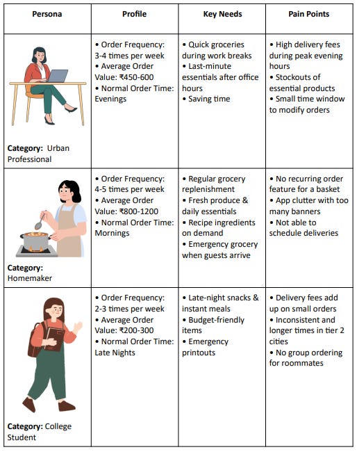
User Persona
Blinkit serves a diverse set of users whose needs change by the time of day, order size, and context. Understanding these core personas will help us uncover where the product delights and where friction still exists.
User Journey
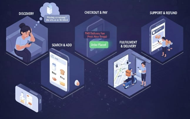
It’s 8 PM on a Wednesday. Riya just got home from work and realizes she’s out of milk for tomorrow’s coffee. She opens Blinkit, not because she planned to, but because a push notification reminded her, “Missing something? We deliver in 10 mins.”
Discovery happens in the moment of need. Whether it’s a craving, a forgotten item, or an unexpected guest, Blinkit positions itself as the instant solution. Users don’t “plan” to use Blinkit instead; they reach for it when an instant need arises.
She types “milk” in the search bar. The app suggests her usual brand, plus some related items other items like bread, eggs, and butter. She adds them all. The cart now reads ₹450. So far, so smooth.
But then comes the first friction. At checkout, she notices a ₹49 delivery fee. Peak hour surge. She hesitates but proceeds because convenience wins. Payment done. Order placed.
Here’s where the magic happens. A notification pops up, “Packing your order.” Then, “Rohit is on his way.”She watches a tiny delivery icon move on the map toward her location. The ETA fluctuates between 12 minutes, then 8 minutes, then 10 minutes. A small anxiety creeps in. Will it really be 10 minutes?
At 9 minutes and 32 seconds, her doorbell rings, and the order is delivered. Relief. She collects her order and starts unpacking. The milk is there. Bread, check. But when she opens the egg carton, two eggs are cracked and leaking.
Now what? She opens the app looking for post-delivery support. There’s a “Help” section, and in the chat window, she uploads a photo of the broken eggs and submits. The response comes later that “We’ll process your refund in 3-5 business days.” The refund is ₹40, but the frustration? Priceless. She needed those eggs for breakfast the next day.
Despite this hiccup, the next morning brings another notification, “Ran out of milk again? Reorder with a tap.” And the cycle repeats. The journey isn’t just a transaction; it’s a habit loop of Discovery, fulfillment, and reinforcement. But within this loop lie tiny moments of friction like the surge fee that stings, the shifting ETA that creates doubt, the occasional out-of-stock surprise, and the clunky support experience when something goes wrong.
Metrics
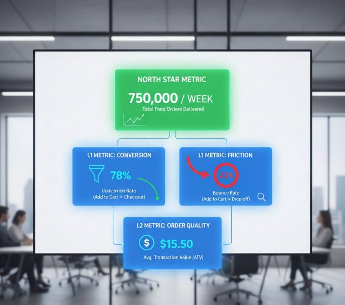
Blinkit evaluates its product performance through a structured metrics framework built around the North Star Metric, which is the total number of orders delivered. This top-level metric reflects the overall health of the quick commerce experience and shows how effectively the platform turns user intent into completed orders.
To understand what drives this outcome, Blinkit tracks L1 metrics such as the conversion rate, which measures how many users move from adding items to completing checkout, and the bounce rate, which shows how many users add items to their cart but leave before purchasing. These L1 metrics highlight friction points within the shopping journey and reveal where users are dropping off.
Alongside this, Blinkit uses an L2 metric, the average order value, which indicates how much a user typically spends per order. This helps assess order quality, spending behaviour, and overall revenue potential.
Together, these metrics map the complete user journey from discovery to payment, enabling Blinkit to identify gaps, optimise each step, and ultimately increase the number of orders fulfilled.
Positive Product Highlights
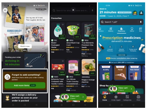
Blinkit’s 1-minute order modification window is one of its most user-centric features. It is built on a clear understanding of real behaviour that users often remember an item right after placing an order or notice a mistake when reviewing their cart. Instead of forcing them to cancel and start over, Blinkit gives them a short, smart buffer to make changes instantly. This reduces cancellations, improves order success, and creates a smoother overall experience.
The platform’s Favourites space for frequently ordered items is another thoughtful addition. Many users repeatedly buy the same groceries and essentials, and having a dedicated space for their top picks removes friction, decision fatigue, and unnecessary navigation. This feature shortens the journey from need to purchase and strengthens repeat usage, which is essential for a high-frequency product like quick commerce.
Blinkit’s expansion into pharmacy and other adjacent categories adds strong strategic depth. Users can not only order medicines instantly but also access free medical consultations after placing an order, which builds trust in a sensitive category.
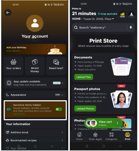
Blinkit’s new parental controls allow users to hide sensitive items, such as sexual wellness or nicotine products, behind a PIN. This is especially helpful for families and shared-device households, giving users more privacy and control over what appears in search and browsing. It shows Blinkit’s sensitivity to user context and enhances trust and comfort on the platform.
Blinkit’s Print Store is another smart value-add, letting users upload documents and get prints delivered quickly. It’s particularly useful for students and working professionals who need urgent documents without visiting a print shop. For the product team, it’s a clever way to stretch the quick commerce infrastructure into everyday utility services, increasing stickiness and frequency.
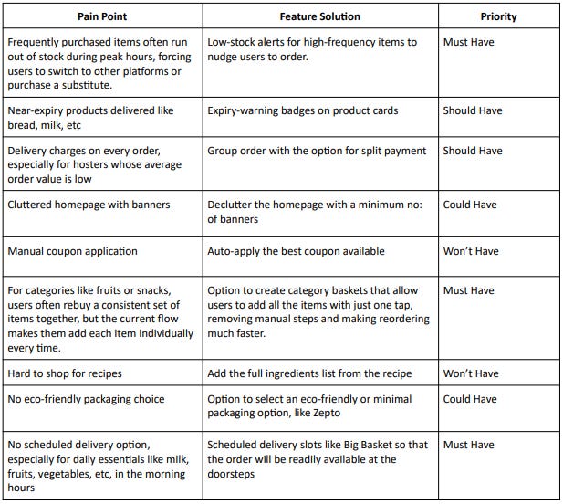
Improvement Areas
Blinkit has nailed speed, but friction still exists at key touchpoints. Here’s what’s broken, how to fix it, and what to prioritize first.
Conclusion
Blinkit has built a powerful quick-commerce engine that combines speed, convenience, and thoughtful features to create a habit-forming experience for millions. Yet, as the teardown shows, meaningful growth now depends on reducing friction, strengthening trust, and deepening personalization. By fixing core gaps and layering in smarter convenience features, Blinkit can evolve beyond instant delivery into a truly indispensable daily-use platform. The next phase is not just about delivering faster, but delivering better consistently.