Instagram Changed its UI. Again.
Instagram can't keep getting away with this. But they do. And each time it reveals a bit more about the strategic direction the company is heading towards. Their latest reshuffle is no different.

First it was the endless shuffling of the “Add to Story” option and the share menu, but Instagram may have gone a bit too far with their latest UI reshuffle.
In this edition of The Product Edge, we break down Instagram’s major UI overhaul — the what, why and how behind changes you may (or may not) have noticed.
So what happened?
Instagram changed a lot of things in one go. Here’s the before and after.
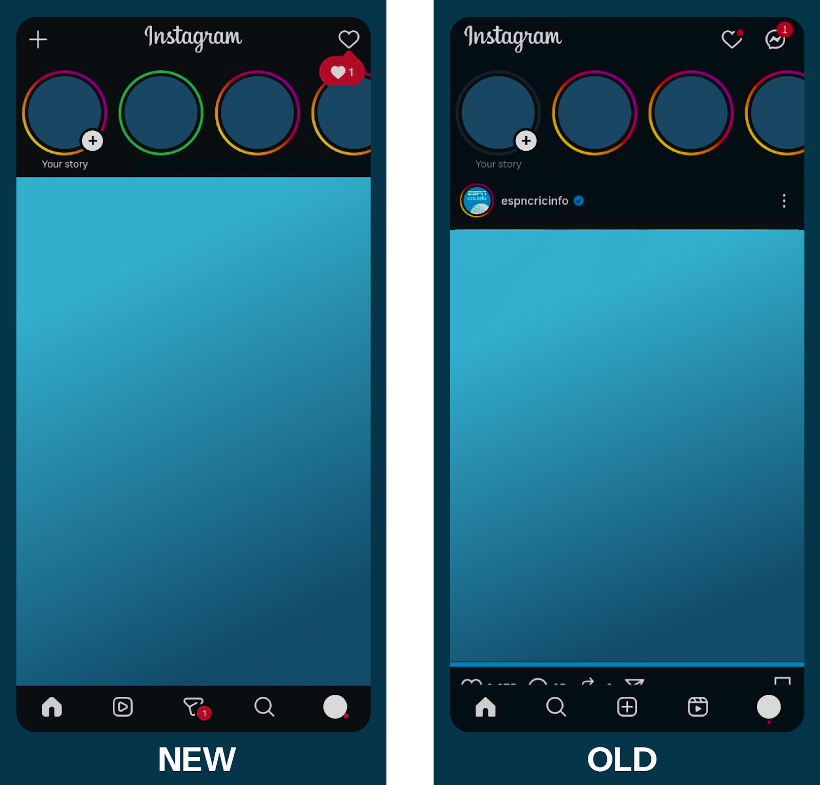
As with most Instagram updates, it was shipped to only a few accounts initially, causing some major problems for people with multiple accounts who would accidentally open incorrect tabs. This is a classic Instagram AB test. User behaviour seemed to match enough with Instagram metrics to prompt them to ship the feature globally.
The UI/UX Changes
Swiping
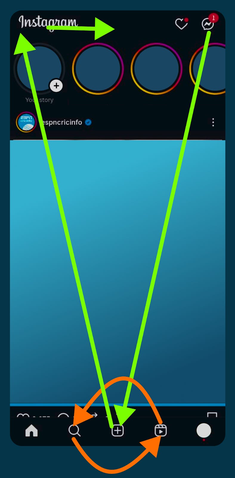
One of the biggest changes to the user experience was the change of the swipe feature. Swiping to the left would take you to your messages tab signified by its position on the home page on the top-right corner. Now, it takes you to the reels page. You can also continue swiping to the messages, FYP and your own profile page before swiping back. The older UI stops the swipe at the messages page. The introduction of this could be due to multiple observations, both statistical and strategic -
Popularity of the swipe feature - could get a few new users swiping to the reels page. Users’ muscle memory would lead many of them to accidentally check out the reels page, and realize that it isn’t too bad, resulting in them spending more time on the platform. (As someone with multiple instagram accounts - some with the update and some without, the writer was an unfortunate victim of this trap.)
Bounce rates on the swipe feature - users could have been swiping to check messages but quickly changing to the for you page (which is to the right of the home page in the bottom bar of the old UI)
Number of direct jumps to the reels page from the home page - indicating the popularity of the reels page, with no easy path there.
Strategically, this could be a signal of Instagram’s shift in focus to reels, and to promote content creators who serve the medium. More swipes result in more time spent scrolling through reels, which creates a larger void of content that can be readily filled by newer content creators. For Instagram’s business, this would result in more ad spots, and hence more revenue.
From a purely UX perspective, the swiping continuity with icons on the bottom bar makes sense against the previous sudden stop after the messages.
Moving the reels icon
But why shift things? This comes down to a key fact about Instagram - it is a mobile app. Mobile users scrolling idly through Instagram aren’t using both hands - they’re on the bus, drinking a cup of coffee, or walking with one hand in a pocket. The ease of access of icons plays a great role here.
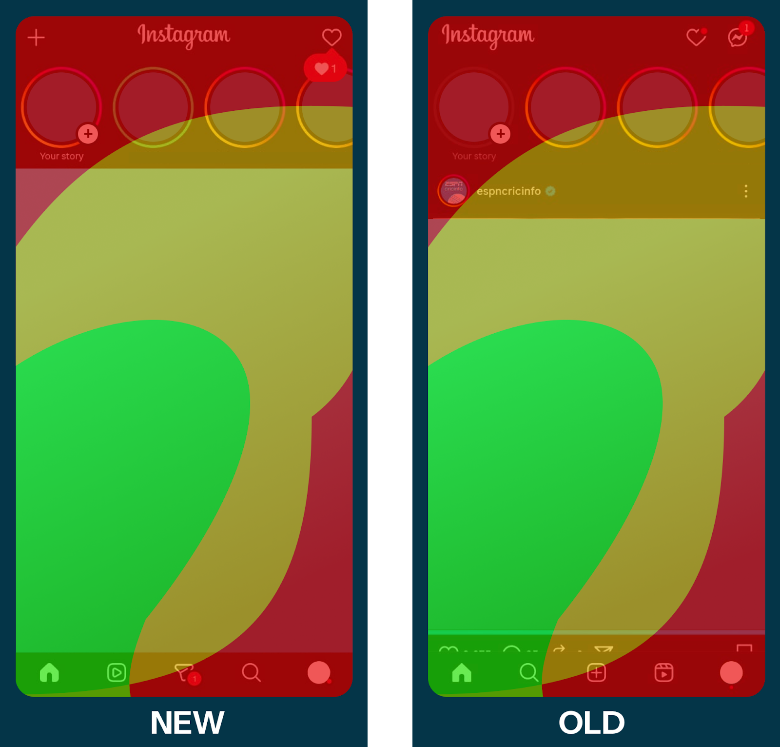
In the heat map (do test it out on your own phones,) the green zones indicate the areas easiest to reach with the thumb of a right-handed user - prime real estate. The shift of the reels page from the red-zone (an impossible access area without a shift in grip) into the green-zone makes it much more accessible, and is an indicator of how much Instagram wants its users to consume reels, rather than single photo posts from the FYP, which has been relegated to the reels’ old home.
This heat map also gives a cool insight into the story feature of Instagram - your own story is out of reach, necessitating intent to post if you were to interact with them, while you can swipe through your friends’ stories if you wished to.
Now, if you were someone who is left-handed, the heat zones would be flipped. If you were eating and scrolling as a right-hander too, you would be using your left hand. So did Instagram miss a trick? This is where the swiping feature shines - you are less likely to be messaging people, and the swipe is an easy enough action with either hand. A single swipe to end up in the reels page, and continuous swiping to stay on it - irrespective of which hand you are using.
Messaging
The swipe→reels feature was implemented at the cost of the messages tab. Is Instagram moving away from messaging? Quite the contrary. A glance at the bottom tab shows that the messaging tab has been allotted decent real estate - the yellow zone, allowing for easy access to messages, instead of its old spot, the rarely accessed red zone at the top right corner. Metrics that could have influenced the decision could include
Idle time - time not spent swiping or scrolling, interpreted as time spent re-adjusting the phone’s grip to reach the messaging icon.
Accidental swiping - swipes to the messaging tab followed by quickly exiting it.
Posting
The movement of the messaging tab to the middle of the bottom bar came at the cost of the posting icon, which has been relegated to the completely inaccessible top-left corner. For one to post now, they should have high intent, reducing the chances of accidental posting (unless of course, you swipe to the right.) Metrics considered before making this change could include
Accidental posts - either times the posting option was selected only for someone to close it, or times media was posted only for it to be taken down soon after. (Instagram’s statistics may be skewed after the writer tested out posting myself for the purposes of this article, sorry about that.)
Infrequent posts - compared to the number of posts a given user creates, the usage of the reels tab and messaging tab would be far higher. Giving such an unused feature semi-prime real estate makes little sense. Further, Instagram is well established as a platform where one can post - it doesn’t need that attraction anymore.
How do they know if it works?
We don’t know for certain. But we can take a gander at what the main metrics a PM at Instagram would be looking at to gauge the success of this move. These could be a combination of improvements on the metrics that prompted the change or more global metrics more suited towards Instagram’s strategic goals.
Improvements on previous metrics include
Fewer accidental swipes, bounces, posts
Lesser idle time - more activity
More intentful checks for messages - opening the messages tab actually results in a message being read.
Strategic metrics
More reels viewed, more time spent on reels
More time spent on the app
More users directly using the reels feature
Less time on the FYP not interacting with content
More ad slots enabled per user
What else can Instagram change?
From the insights we’ve gathered here for this existing roll out of changes, Instagram has a lot more changes to consider
Shifting the likes, comments and share icons on reels - they are currently on the far right, right in the inaccessibility region of most users (right-handers.) While this could maintain more high-intent likes, it might dissuade users from interacting with the post. The new 2x speed feature which requires you to keep the screen pressed off center could clash with this proposed area. A reshuffle would require a tricky balancing act. Double tapping for likes is a great solution.
Fixing swipe responses for messages - unlike WhatsApp, Instagram requires you to swipe all the way from the left side of the screen to right to tag and respond to a message - basically moving across all the regions of the heat map. WhatsApp on the other hand, requires only half a screen’s worth of movement, entirely possible with the green zone.
What can we learn?
Instagram’s simple motive of being more reels-first has resulted in a massive reshuffle - moving reels, FYP, messaging and posting. They’ve visually made two disjoint sets of changes. Unfortunately, changes in metrics could be attributed to any of these individual changes. Tracking down which one specifically could be quite the task for a PM. Further, the massive change in UI could disgruntle many loyal users (which shouldn’t matter considering the lack of alternatives), and it might have been preferable for them to make some more subtle changes before this massive rollout.